
Time Magazine Analysis
-
Our goal with this project was to analyze the structure, typographic treatment, grid structure, unity, and comparison between the online and print versions of TIME magazine. We were looking into the magazine's use of color, user interaction, hierarchy of information, article layout for the purpose of a gaining better understanding of how a publication is constructed.
-
After performing research, we began to analyze TIME magazine. We developed a taxonomy that breaks down the magazine into different parts based on the hierarchy of information that then further breaks down the types of information into the use of fonts, colors, graphics etc. We then analyzed the grid structure of the print magazine versus the website. Finally, we assessed the attitude or style of TIME magazine by highlighting similarities and differences between the two versions.
-
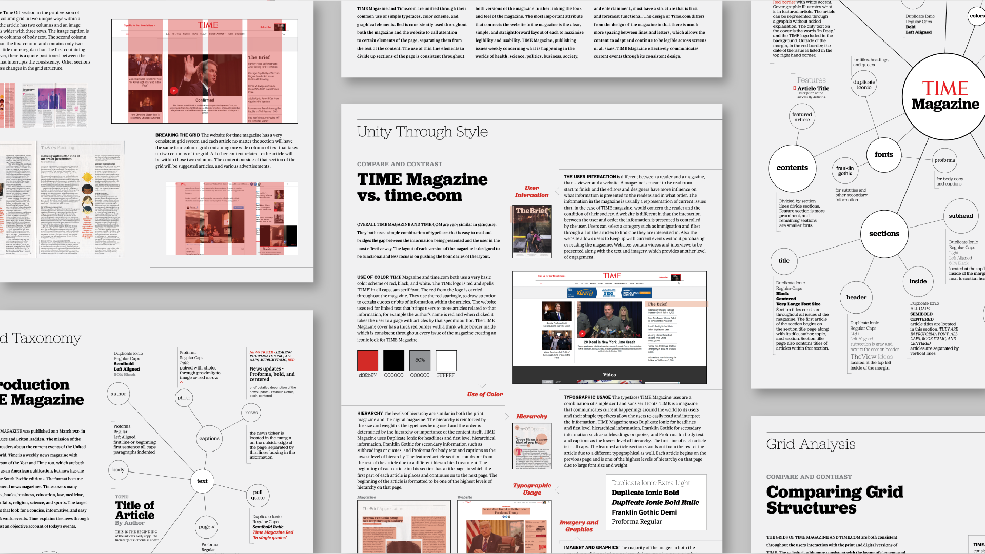
With the information we found we presented it on three different broadsheets to communicate what we found clearly, while maintaining the stylistic choices of TIME magazine. The first included the background of TIME magazine, how it began and what type of information it publishes. The second broadsheet shows the grid analysis of the two versions comparing the similarities and differences. For the final broadsheet, we described similarities that unite the print and digital versions of the magazine as well as differences between them.
Print Design, Typographic Analysis, Grid Analysis, Collaboration
Final Broadsheets
Our task for this project was to research the typographic and information system of TIME Magazine. We designed three reference broadsheets, a form of information graphics to be referenced by outside readers. The collected research documented and designed on the broadsheets serve as a guide to what it takes to make the publication.

Typographic System Analysis
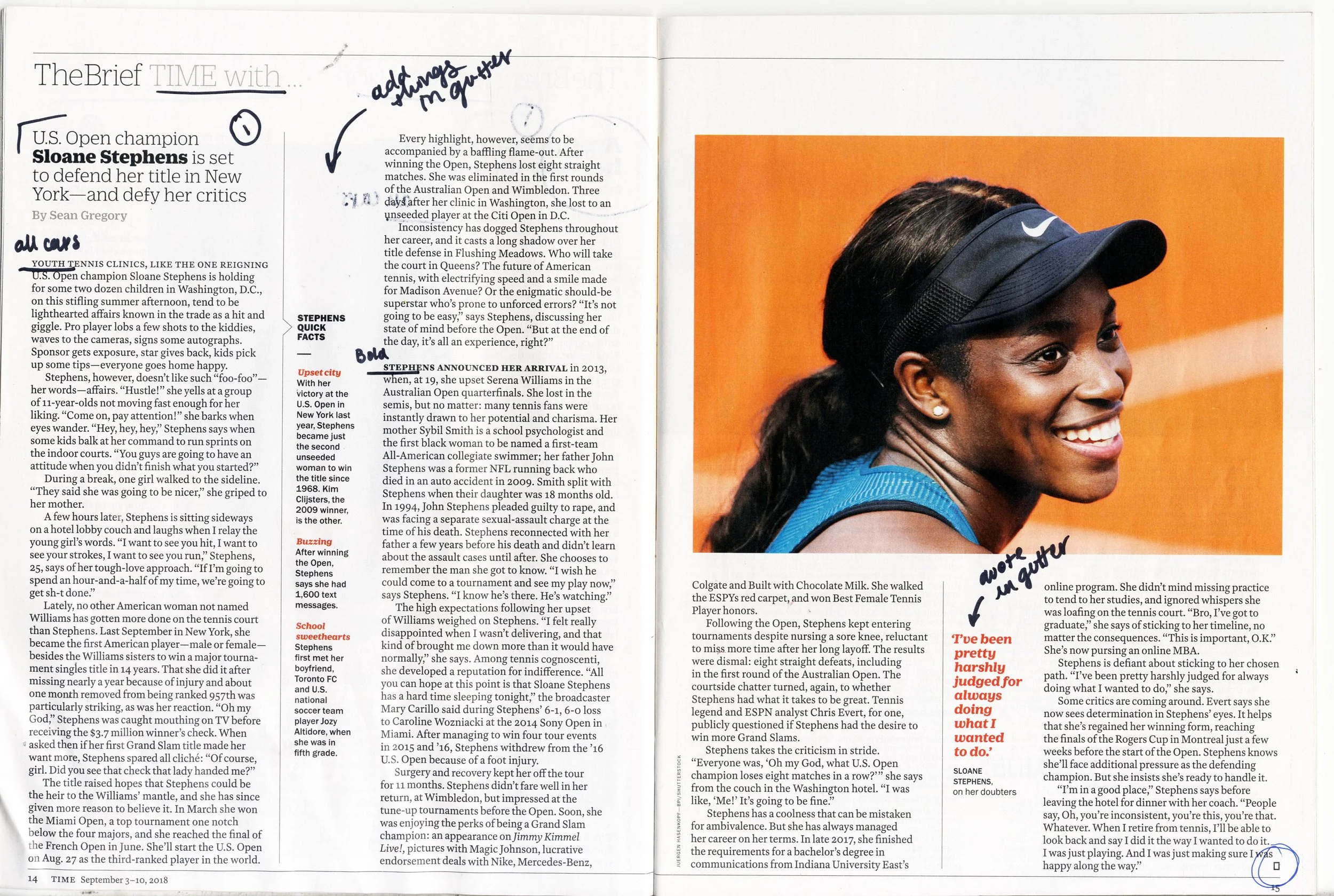
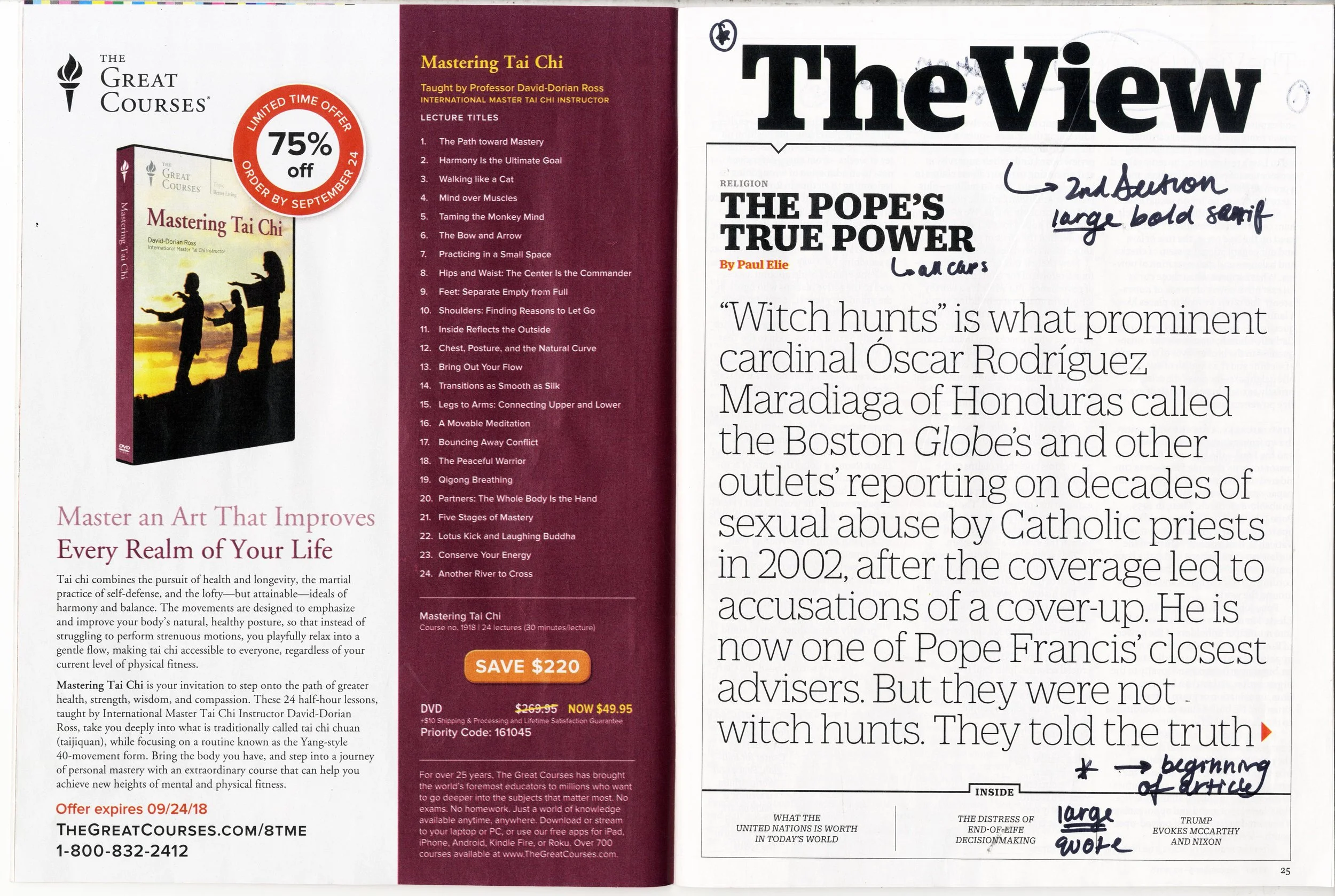
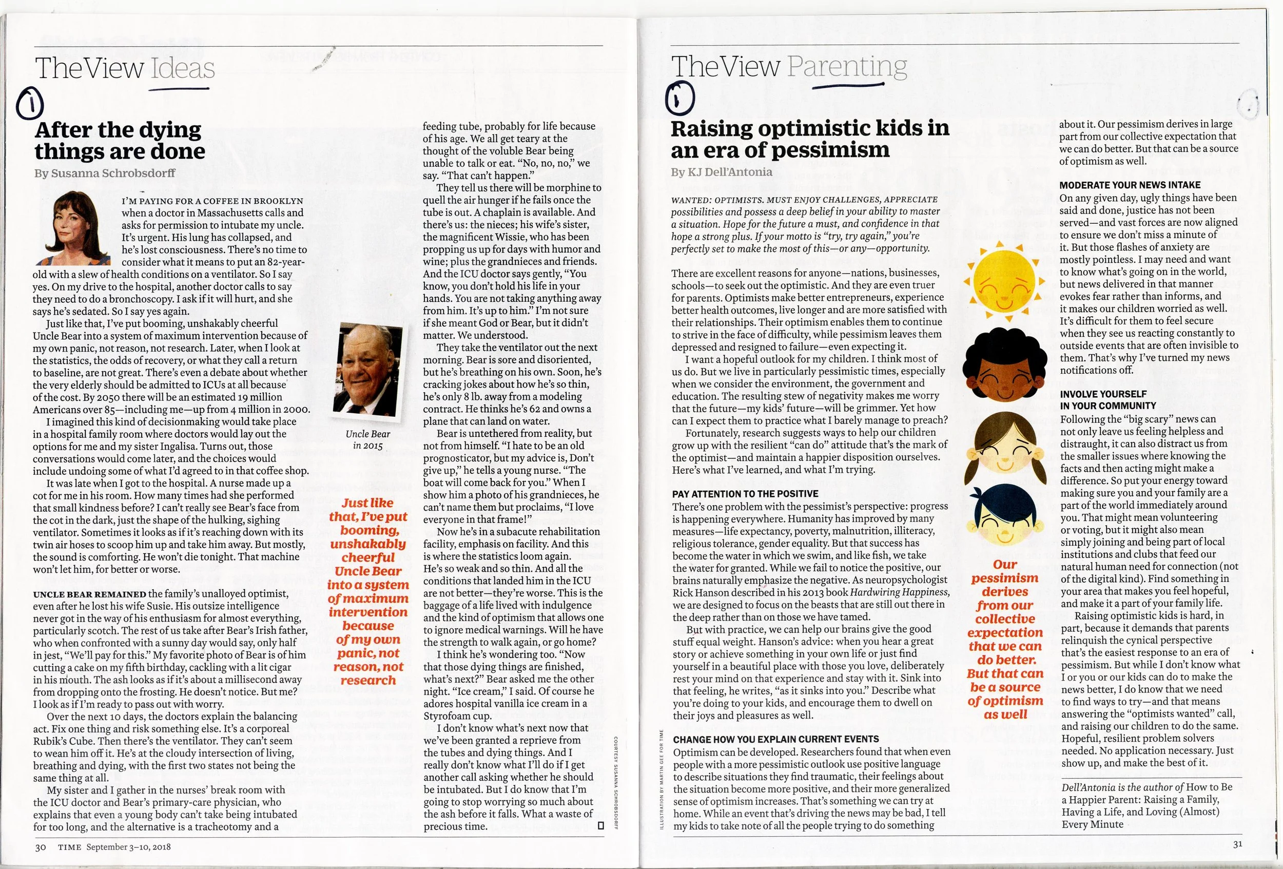
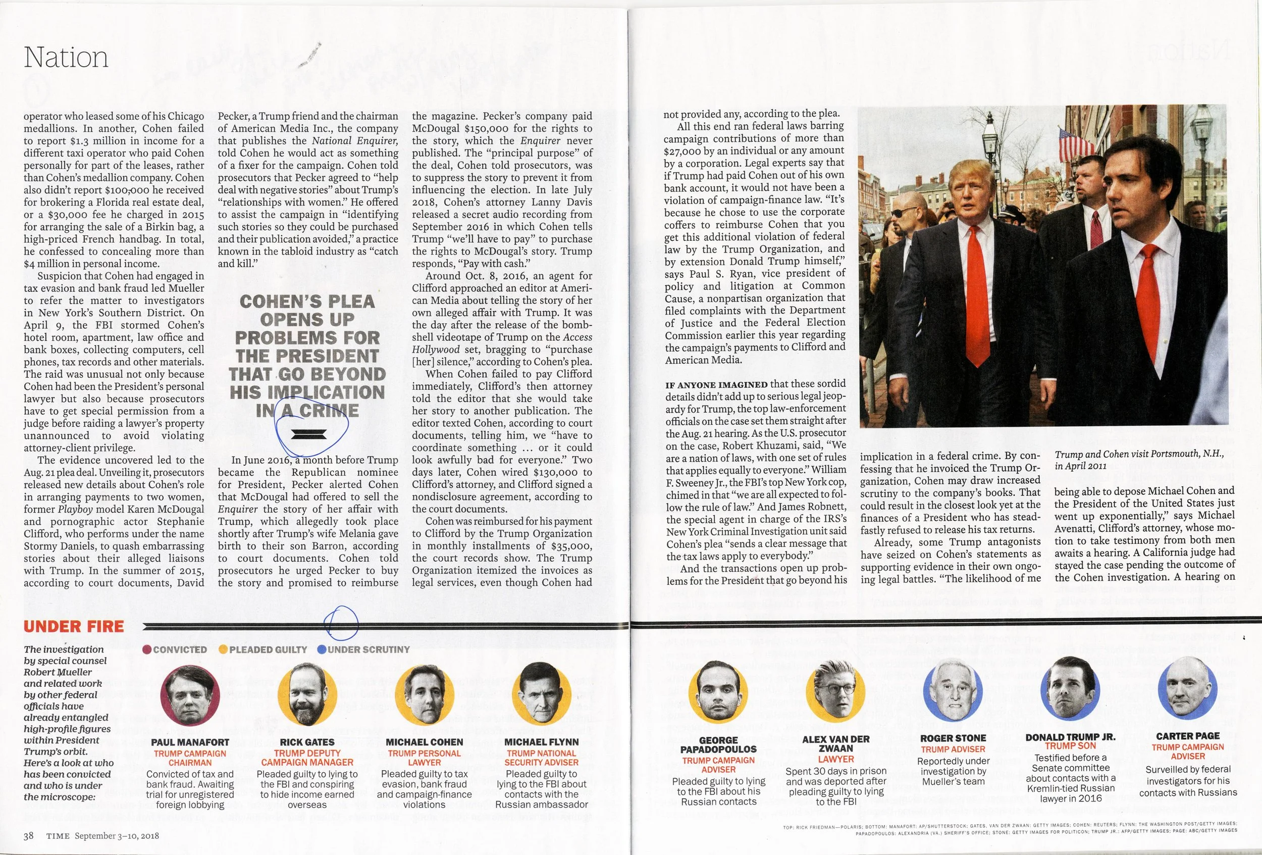
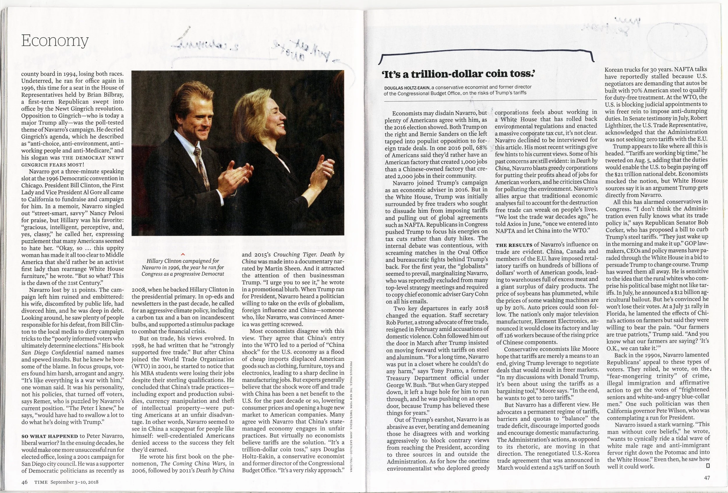

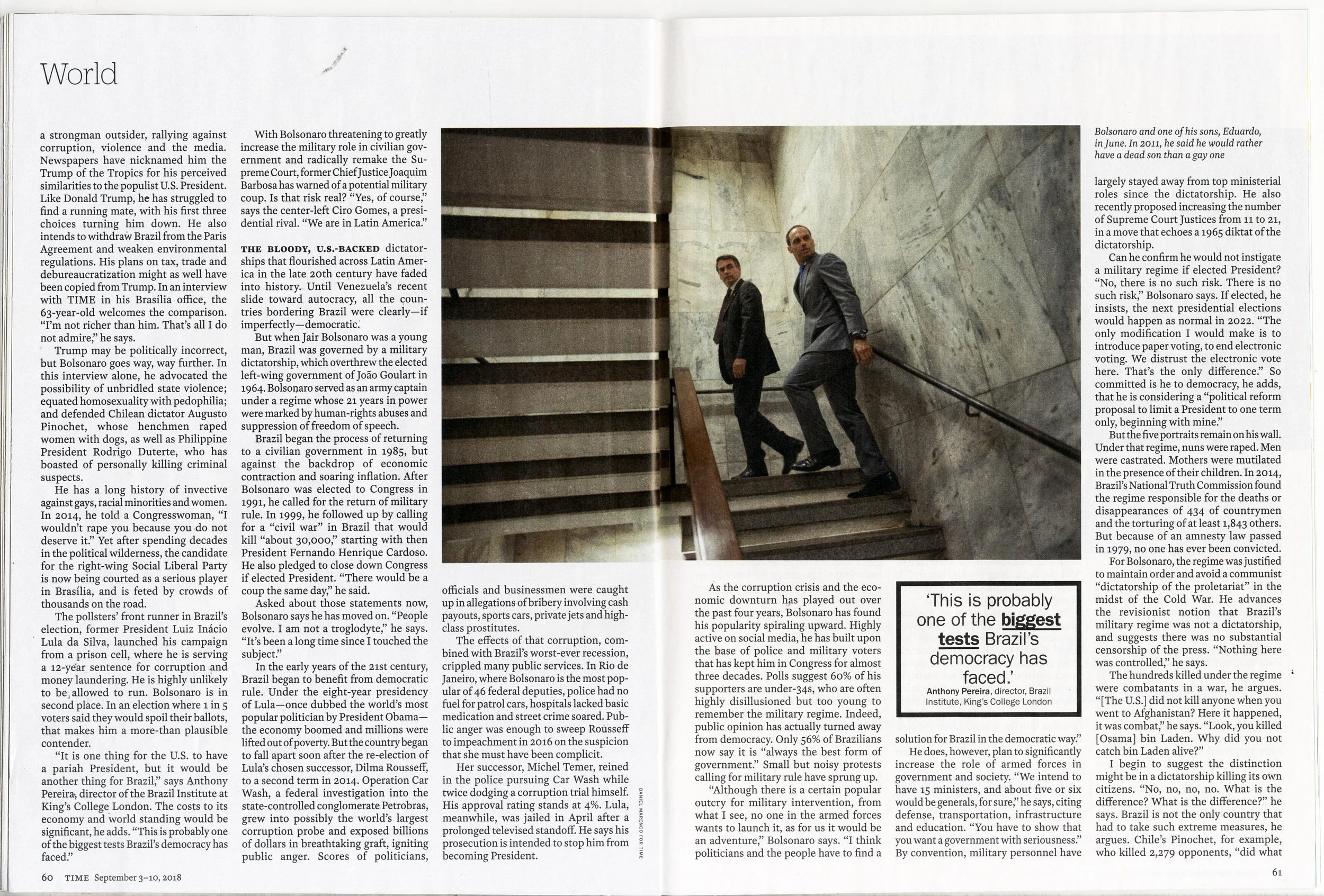
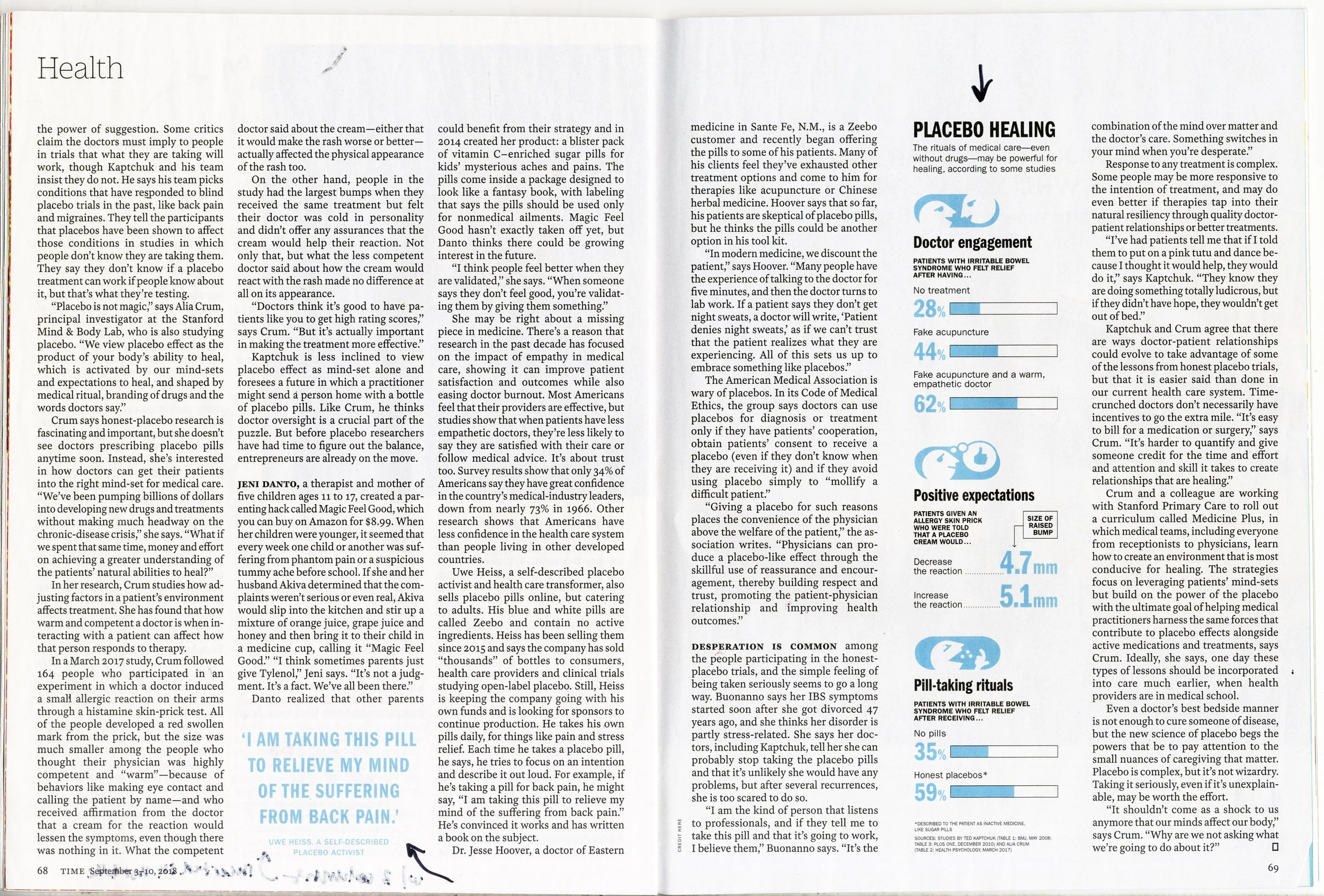
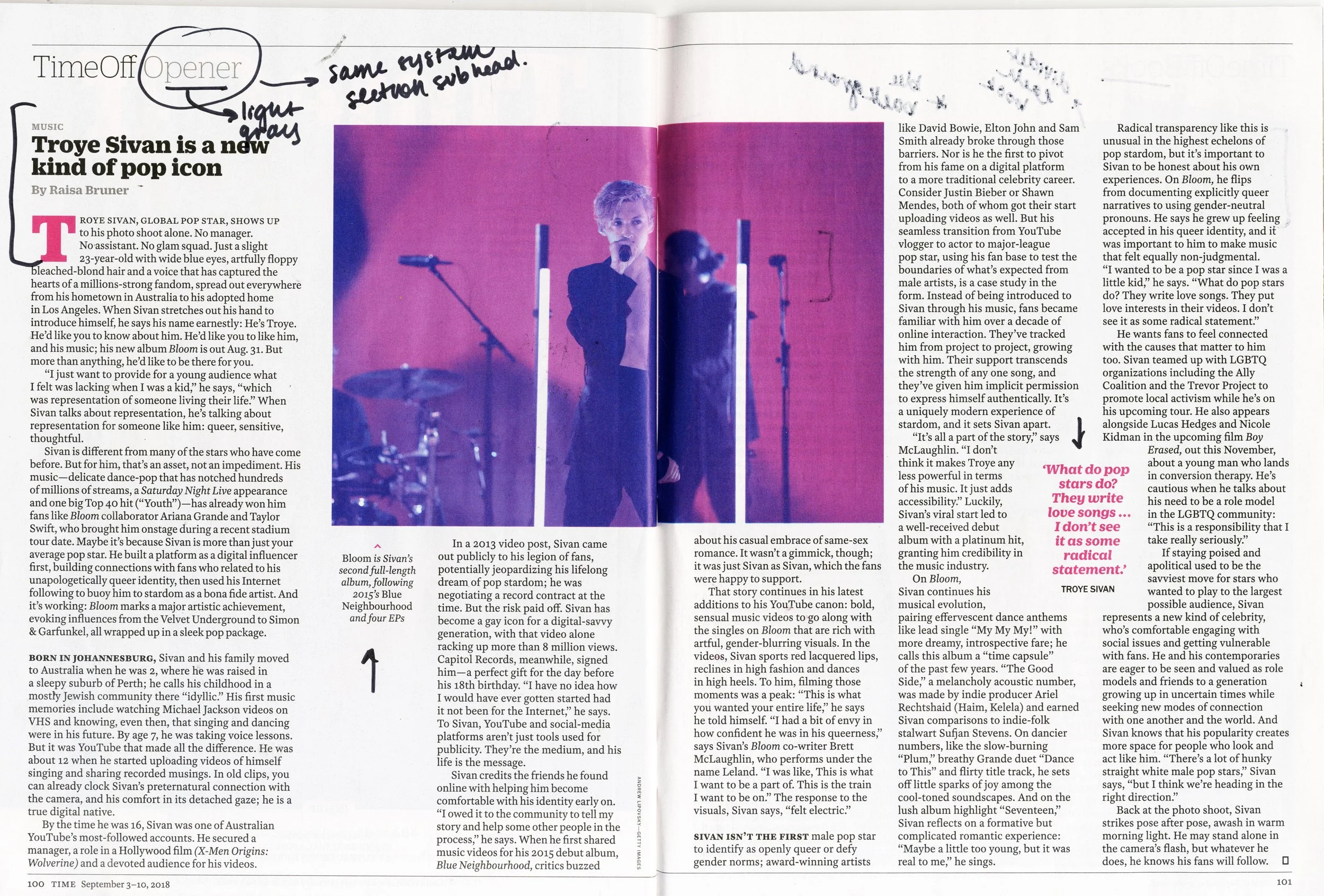
Intro & Taxonomy
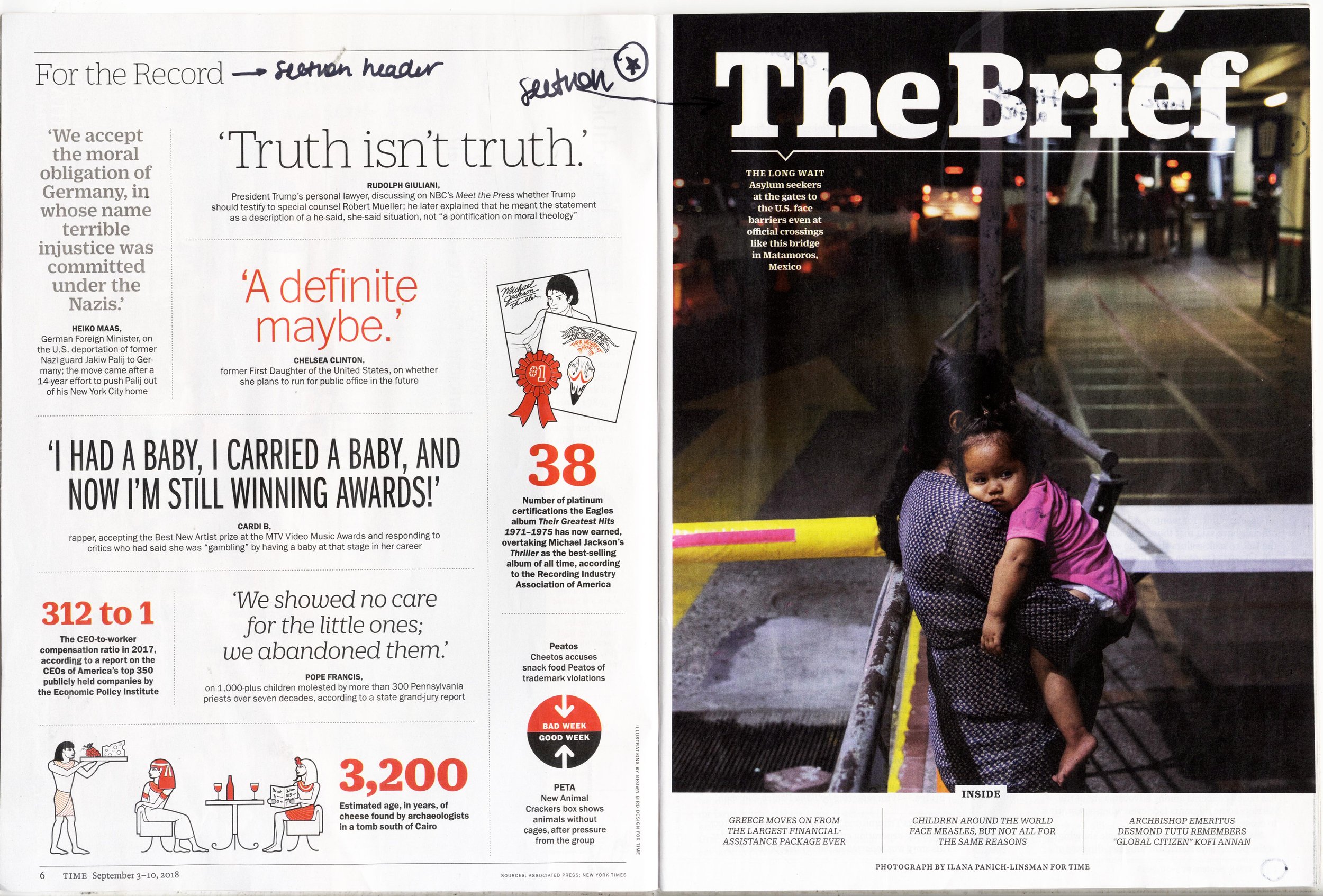
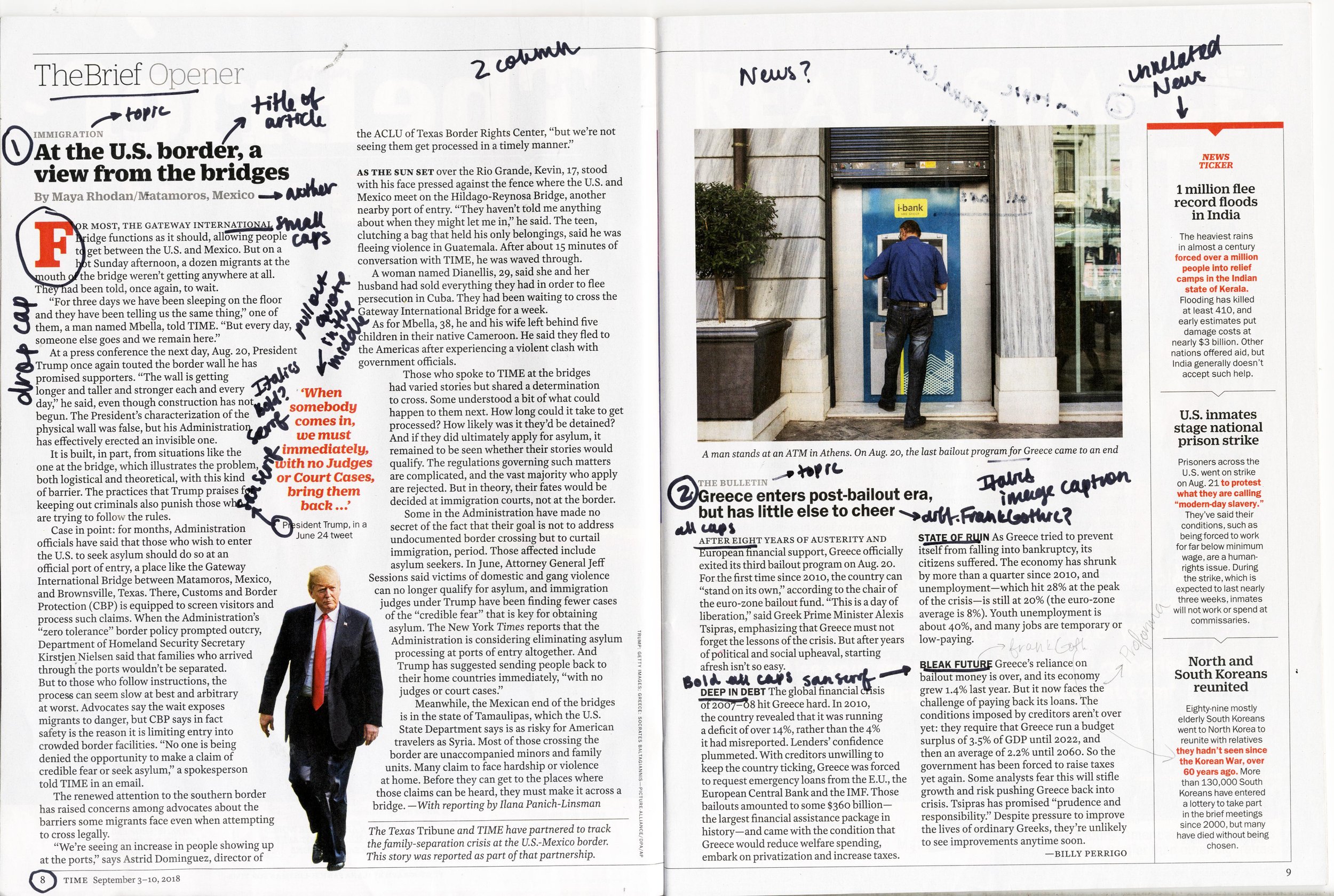
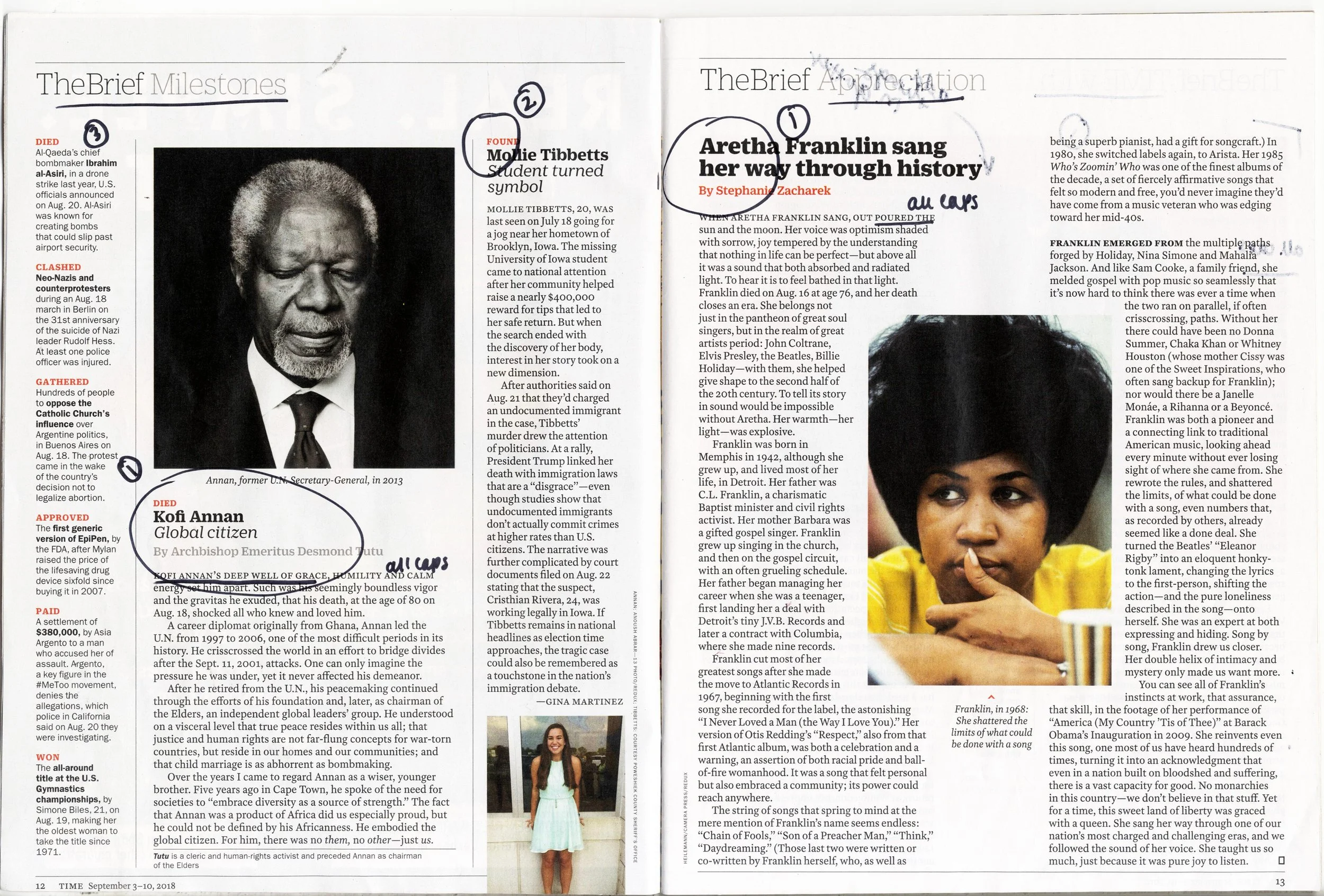
The first broadsheet is an introduction to TIME Magazine and a taxonomy of the typographic elements. The introduction is an overview describing the mission, content, audience, frequency of publication, and production values of the magazine. We analyzed the typographic roles and hierarchical relationships including image usage, symbols, and graphic elements found in the print version of the publication. Then, we build a taxonomy that categorized those elements.

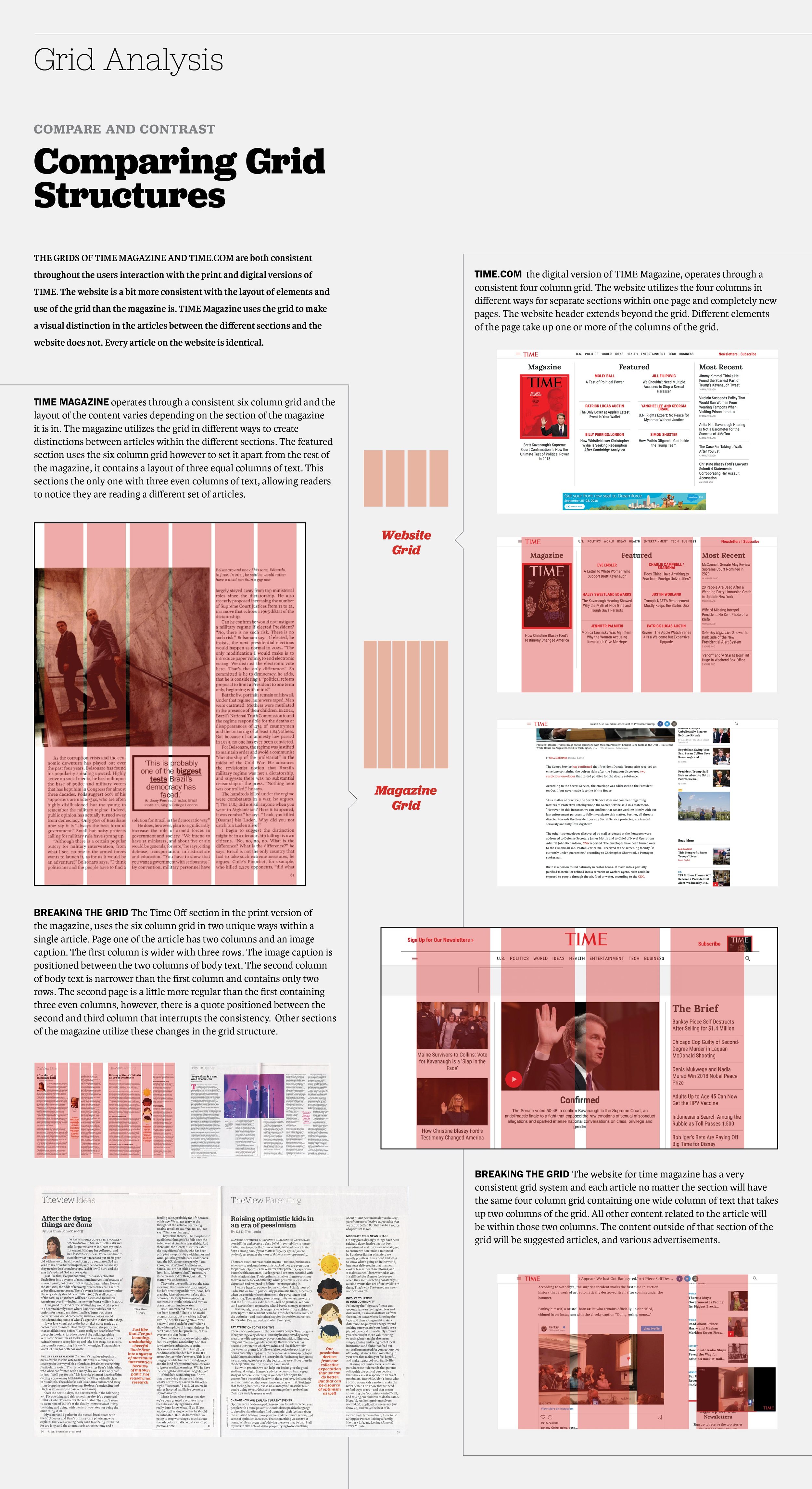
Grid Analysis
This broadsheet shows an analysis of the grid structures of both the digital and print versions of the publication. Using a visual diagram we were able to see how the publication uses their grid structure as a system throughout the publication, highlighting the areas of inconsistencies and where they break the grid.
Unity Through Style
In creating this broadsheet, we selected attributes from the analysis of the publication and visually described similarities and differences that united (or not) the print and digital versions of the publication, and the differences that reflect the limits or affordances of each media. Using what we found through this comparison we assessed the attitude (style) of the publication.
